Wednesday, 31 January 2018
Friday, 26 January 2018
Monday, 22 January 2018
Sunday, 21 January 2018
Friday, 19 January 2018
Thursday, 18 January 2018
Today's Progress:
As previously mentioned, I planned to use this app called 'Glitche', which was made specifically to edit pictures with certain special effects.
So I originally said I'd use it for the font on the front/back cover and on the advertisement. However, I'm fine with the way they look (see previous post) and don't think they need to be edited in this way.
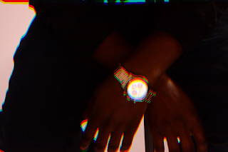
Here's the outcome of using Glitche to edit my pictures. Which will be used for the insert/cd..
BEFORE:
AFTER:
To create this effect, I used the 'Mirror' option on the app, and moved about the image until I was happy with how much reflections I wanted there to be *more screenshots coming soon*
I also used the 'Blur' option which is how I got the coloured outline around the image.

This inspiration was coming from a promo poster that I saw from the artist Angel. And as mentioned in our digipack pitch, we wanted to incorporate the blurred effect as it allows the audience to take on the title 'addicts'. As it's known that when someone is intoxicated, they tend to have blurred vision. So technically, putting the audience in the artist's shoes. This is what I plan to use for the inside/insert of the album.
Then I edited this image below, this is what it originally looked like, the way how we took it in the studio. Compared to how it looked after editing it on Glitche.
BEFORE:
AFTER:
To create this effect, I used the 'glitch' option, this is where you are able to purposefully distort the image to a certain degree, so it mimics a technical glitch. I really liked this effect.
AFTER:
Tuesday, 16 January 2018
Today's Progress:
Again today, I tried working on the inside of the cover (inserts) of which I felt that I made little to no progress in.
All I did was grab the edited picture from InDesign and place it into Photoshop, as on InDesign, it's easier to change the actual image of a photo into a different shape.
Below, is my ongoing edited version of the front cover. The original picture was too dark and the background didn't go along with my colour scheme, as it was very orange.
So I began to watch different youtube videos and read different articles to get an understanding of how to change the background colour.
Here's the finished result of the editing and my attempt to brighten up his eyes. It worked but I plan to mess around with the features abit more to get a proper understanding of it.
I plan to restart my front cover again tomorrow as I don't really like the image and to me it looks obviously photoshopped.
Monday, 15 January 2018
Today's Progress:
Today I just created the templates for all the different parts of the print products, along with the right measurements.
But i began working on the insert first and then moved onto editing the CD front cover.
I moved the image about a few times to see which looked better, I wanted to make sure that the watch was showing, as that is quite an important focus - jewellery, connoting riches - of the song.
This is how I decided to position the picture, with the centre of the CD disk right on top of the watches' face. I strategically placed it like this. One, because this same picture would be used for the back of my CD cover so they would've already seen the full image and my print product would have some sort of continuum.
Secondly, I thought it looked quite aberent to have a 'faceless-watch'. To kind of connote the idea that time is inconsequential. The purpose of him wearing the watch isn't to see the time but more so, for the fact that it's jewellery and made out of gold. Therefore, it's more of a representation of his status.
Saturday, 13 January 2018
Friday, 12 January 2018
Photo Shoot for CD cover and Promo poster
Yesterday afternoon, we had our photo shoot for the CD digipack.
Below is some of the pictures showing the outcome of the shoot.
In the first 5 pictures, we were testing the the camera out on ourselves, by using the light equipment to attain the right lighting for the shoot.
We also adjusted the exposure and white balance to get a perfectly lit image.
We found that having the White Balance on the 'shade' effect, gave a really good finish, as shown on the last picture. This perfectly sets the tone for our song name and cover.
However, from ealr on we decided that our colour scheme would be black, white and red. So we would have to change the background colour from yellow to another colour. or even to a stronger shade of yellow (by using saturation) to appear more of a gold yellow colour.
Overall, we are quite happy with the outcome of the shoot, and we have got some great pictures that can be used for our print products.
Thursday, 11 January 2018
Wednesday, 10 January 2018
Video Feedback for Music Video
Here's the video feedback for our music video.
It's quite difficult to pick out what's being said at times, so here is the transcript of the feedback.
The transcript
So as picked out from the conversation, the positive points that we got back were:
And feedback regarding anything else....
Today's Progress:
For our front cover, we wanted to have a close up or mid close up of the artist. Around him we would have different steaks of light, like in Angel's -Take You Home promo poster/video, which I've previously posted. To do this, I will use the app 'Glitche'.
http://glitche.com/
http://glitche.com/
Tuesday, 9 January 2018
Monday, 8 January 2018
Today's progress:
Today I finished the mock-up cd front and back cover.
We also booked the time for the studio CD photoshoot.
Which is at 3pm on Thursday 11th January 2018.
We also are started getting together what we'd want the shots for the shoot to look like and what the costume would be like.
I fully completed my case studies by adding in two more promo posters.
Sunday, 7 January 2018
Saturday, 6 January 2018
Thursday, 4 January 2018
Today's work: CD Front cover mock up
Measurements of CD cover:
For Photoshop
Front cover & Back Cover:
139mm x 125mm
Spine:
6.5mm x 125.5mm

For Photoshop
Front cover & Back Cover:
139mm x 125mm
Spine:
6.5mm x 125.5mm
How I made my CD Cover:
First, I customised the size of the page so that the width was longer than the height, in order to mimic the actual measurements of a CD cover. Then I split the page in half and drew a black line down the centre, to imitate the spinal cord of a CD. Then I placed the picture onto the left-hand side, as that's what I want for the front cover.
Then I spent some time messing around with the fonts. I wanted to settle for one that helped connote the genre and fit inline with the style of the cover and song name.
I also googled 'what type of fonts rap CD's and posters used', so that it would appear more realistic.
I finally settled for 'Viner Hand ITC'.

Here I added the 'Parental advisory, explicit content' logo, as that's what CD covers tend to include, as a warning to younger viewers of some of the themes it contains.
In these 2 pictures below, I played around with the look of the spine and which font would look better for it. I wanted something that was similar to the font used for the title, but more professional and that matches the colour scheme.
Now the front cover of the CD cover is finished, it looks like the above picture.
Wednesday, 3 January 2018
Tuesday, 2 January 2018
Additional Promo Adverts
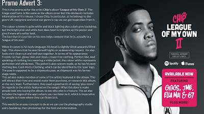
According to some feedback I was given by one of my teachers, I need to upload 3 promo adverts, as I only have 1 for my case study so far.
It was quite challenging finding much promotional posters that are both relevant to my genre and look professional.
By then end of the day, I have up researched and added 2 more promo ad's to my case studies power point, as long as I try to annotate and link it to the promo ad that I plan to, then it doesn't really matter if it belongs to the same genre.
Here is the screenshots of my progress and the analysis I've done of the promo ad's.
Below is the link to the previously done case study.
Subscribe to:
Comments (Atom)


