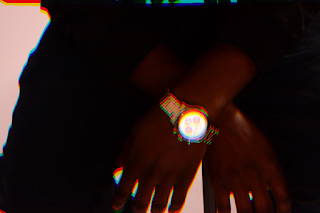
As previously mentioned, I planned to use this app called 'Glitche', which was made specifically to edit pictures with certain special effects.
So I originally said I'd use it for the font on the front/back cover and on the advertisement. However, I'm fine with the way they look (see previous post) and don't think they need to be edited in this way.
Here's the outcome of using Glitche to edit my pictures. Which will be used for the insert/cd..
BEFORE:
AFTER:
To create this effect, I used the 'Mirror' option on the app, and moved about the image until I was happy with how much reflections I wanted there to be *more screenshots coming soon*
I also used the 'Blur' option which is how I got the coloured outline around the image.

This inspiration was coming from a promo poster that I saw from the artist Angel. And as mentioned in our digipack pitch, we wanted to incorporate the blurred effect as it allows the audience to take on the title 'addicts'. As it's known that when someone is intoxicated, they tend to have blurred vision. So technically, putting the audience in the artist's shoes. This is what I plan to use for the inside/insert of the album.
Then I edited this image below, this is what it originally looked like, the way how we took it in the studio. Compared to how it looked after editing it on Glitche.
BEFORE:
AFTER:
To create this effect, I used the 'glitch' option, this is where you are able to purposefully distort the image to a certain degree, so it mimics a technical glitch. I really liked this effect.
AFTER:


No comments:
Post a Comment